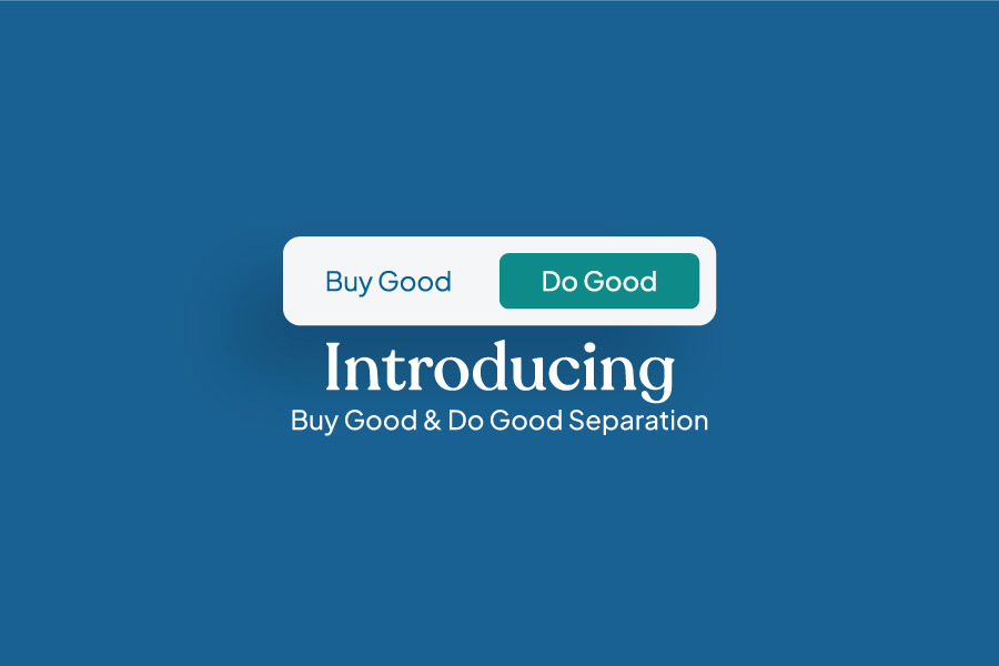
Simplifying Impact: Introducing Buy Good and Do Good Separation

At Aseel, we value our users and their feedback. Your input is important in shaping our platform and improving the user experience. We have listened, learned, and taken action to enhance your browsing experience.
Today, we are thrilled to announce a significant update to our website based on your valuable feedback. Introducing the separation of Buy Good and Do Good on Aseel. We have taken an important step to enhance our user experience and clarify our purpose, making it easier and smoother for you to navigate with just a click of a button on the homepage, to choose your path to Buy Good and/or Do Good.
Back in Aug 2021 - In the wake of the collapse of the Afghanistan Republic, the country plunged into a severe humanitarian crisis. The unemployment rate skyrocketed, leaving 99% of the population living in poverty. As a response to the situation, as a technology company, Aseel built a dedicated humanitarian response platform (when we call it Aseel’s emergency response) on top of our e-commerce system now called Do Good.
To facilitate efficient aid distribution, we created the Omid ID system. Omid ID enables tus to identify individuals and families in need and connect them with their required assistance. We have curated aid packages of essential items such as food, clothing, and hygiene products. Anyone from anywhere in the world can purchase these packages through Aseel and send them to the Omid IDs of those in need. In addition to that, we implemented fundraising campaigns similar to platforms like GoFundMe. This feature empowers individuals worldwide to start campaigns and raise funds for different kinds of support for the vulnerable families and individuals.
Through our usability tests and conversations with first-time users, we identified a common challenge. it was difficult for them to grasp the full scope of Aseel when landing on our website. The coexistence of two distinct products - Buy Good | Do Good - on the same platform caused confusion, especially for new visitors.
To address this issue, we made the decision to separate Buy Good from Do Good. While separating Buy Good and Do Good to different domains was initially considered, we wanted to avoid the inconvenience of having users navigate between two separate websites. Our goal was to provide a unified experience where users can seamlessly explore both options without any additional hassle.
With the implementation of new updates, finding the Buy Good | Do Good buttons has become easier, regardless of your location on the site. When you land on the Aseel homepage, you'll immediately notice the Buy Good button prominently displayed at the top of the page in blue. Right beside it, you'll find the Do Good button, distinguished by its green color. But what if you're on another page, such as browsing a product, supporting a campaign, or reading this blog? Rest assured, we've got you covered. Now, you can conveniently access the Buy Good and Do Good buttons from any page at the bottom of the page, within the new navigation menu. Each button is clearly marked with distinct colors in the left corner.
We understand that navigating in Aseel could be overwhelming for first-time visitors. Your feedback highlighted the need for a more streamlined and intuitive user experience. With the separation of Buy Good and Do Good, we have made it easier to choose between supporting artisans through purchases or extending a helping hand to those in need through your aid campaigns or donations.
We would love to hear your feedback, so kick off your shoes and **click** to explore a closer look of the new website NOW!


